JOIN THE
NEWSLETTER
GET NEW POSTS SENT STRAIGHT TO YOUR INBOX
YOU JUST RELAX AND SIT THERE!
+
GET A BUTT LOAD OF TEXTURES I USE IN
MY OWN WORK FOR FREE WHEN YOU SUBSCRIBE.
It's free. No spam. Unsubscribe anytime you like.
You will also instantly receive a free collection of textures that I use in my work!

Welcome back! In my previous post I mentioned I was hired to produce some background and character designs for an animation studio — the wonderful London based Picnic Studio. It was a bitter-sweet job, a dream opportunity that got snatched away too soon, though through no fault of the studio I must say!
—
The studio had been hired by a big sports brand to produce an animated TV advert in the style of a black and white Japanese anime. They had seen my work* and liked my style, asking if I’d be interested in producing character designs and backgrounds for the animation.
Attached in there email was a PDF file explaining the style they were going for along with visual references to Akira and Katsuhiro Otomo, at which point I started to salivate.
It sounded like a big responsibility, but it was an opportunity to produce work in such a wonderful style and with the potential prospects the job could bring it was too much to turn down. I also felt flattered that they sought me out and consider me to undertake what would be a big contribution to the look of the whole animation.
With pretty much most jobs offers that sound good to me I will always tell the client “Sure, I can do that for you, no problem.” I feel confident enough at this stage in my career, with the success of past jobs and the creative challenges I’ve faced that if I just say “Yes” I can find a way to get it done.
In the early days I used to over-think things and question my abilities; “Am I good enough to produce what they’re asking for?”. But my past successes have taught me to stop that sort of thinking, now I just slap myself and say “C’mon man! You’ve done it before, you can do it again! And you’re even better now than the “you” that did it before!”
This is one of the things that drives me the most when taking on new projects, just saying “Yes”, then having that adrenalin kick in, working out the angles and planning how to get it done.
In the end I guess it made sense to the studio to have specific individuals on each task, so I was given the sole task of background/set designs. I was fine with this because it meant I could put all my focus into producing some really great quality backgrounds for them…
I was working remotely for the studio and wasn’t sure how quickly I’d need to get each background completed. I had a week or so before I was given my first set to design so I decided to be proactive and get in some deliberate practise.

I’m not a fan of using rulers and it’s only on rare occasions I will ever use them, even so I knew I’d probably need to use them for the stuff I was doing. I researched into the sketches of architects**, looked into ways of actually improving the way I draw lines. I also remembered that a friend who studied architecture told me that one of his weekly lessons consisted of just drawing straight lines.
I found some really interesting Youtube videos on straight line practise which simply involved drawing lines from one dot to another, over and over again, filling the page. I started doing this as a warm up exercise for five minutes every morning.
Unfortunately***, in the end the client(sports brand) contacted the studio and told them they were pulling the plug on the animation idea and decided to go for a different concept for their ad. This was without even having seen any of the beautiful work the whole team had produced so far, and was a real bitter pill to swallow for me and the rest of the talented animators and designers that had been hired to work with the studio.
I only got to do two-three days working on the background designs in the end. Even though it was a short job it was a real pleasure to work on and I can’t say enough good things about the studio and the people I was working with.
So here are two of the designs I produced in that time:
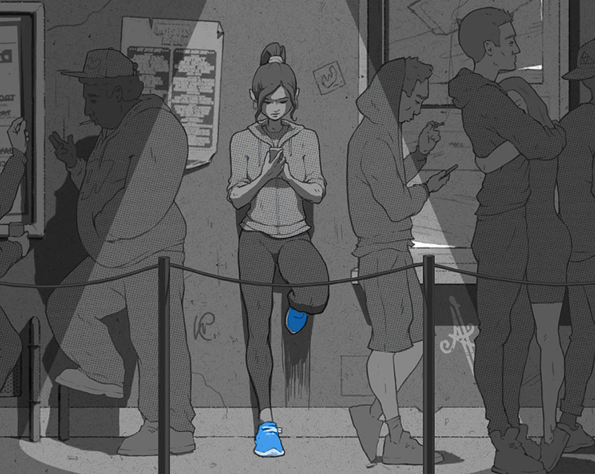
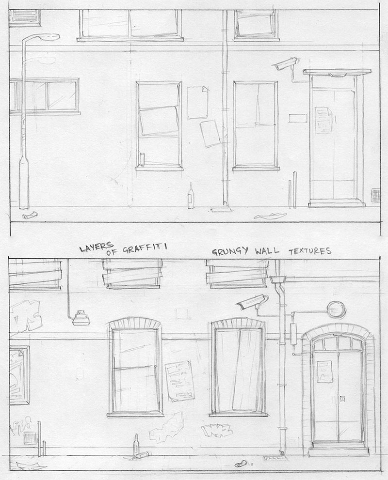
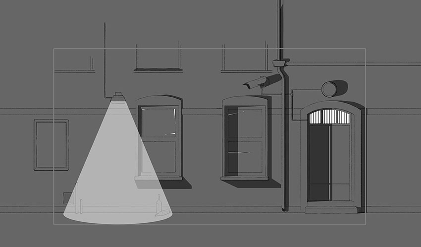
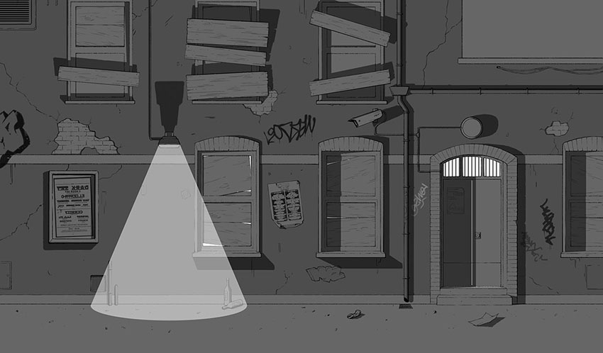
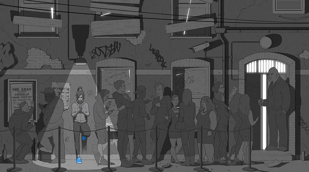
This was the first environment I started working on. The idea was to create an outdoor scene of a grimy looking underground club where one of the main characters would be queuing up, waiting for her boyfriend.
At the time I was living in a very urban area so I was able to go out at night and take photos of deteriorating walls, graffiti, all the little pipes and cables that stick out of the building work. I was able to create a sort of visual library to refer to when designing the scene.
A little trick I learnt from Liam, one of the directors at the studio who I was submitting stuff to, was to add little cracks in the walls and extra markings to help fill in large blank areas in the design. It’s little tips like these that you take forward with you into future work.
I added my own character designs to fill the scene so it would look more appealing in my portfolio.


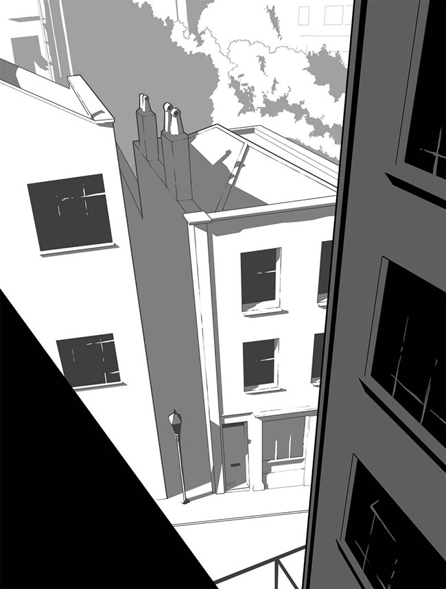
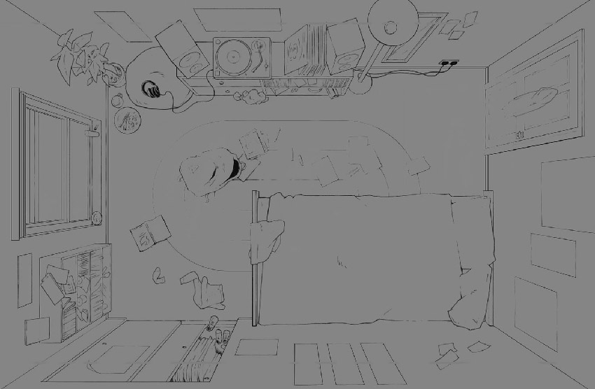
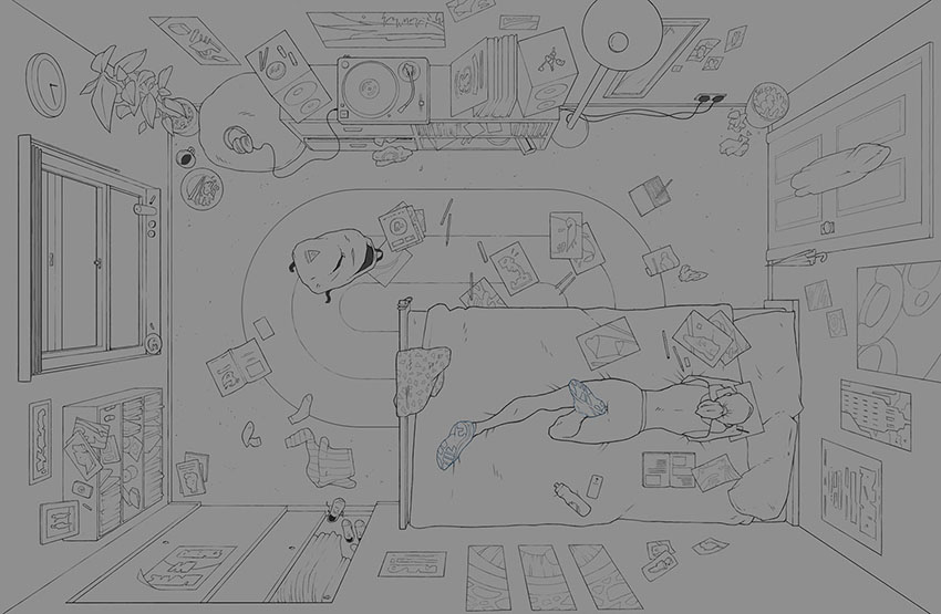
This was the second background I started working on and only got halfway through before the job was cancelled. The studio were interested in seeing what it would’ve looked like finalised so I gladly finished it and sent them a copy. Once again I added my own design of the girl character to make it a more interesting piece for my portfolio.
Getting the perspective actually wasn’t too difficult on this. It was just a matter of placing a vanishing point in the centre of the image and making everything draw towards that point.
I really love this piece and I’m considering making it into an inspiring illustration about working at the things you love.


Hope you enjoyed this post and feel free to ask me anything or just leave a comment. Would love to know your thoughts.
—
2 Comments
Sean
27th July, 2015This is sweet! Great posts, demonstration of process, and handy tips to practice. nice.
Ains
28th July, 2015Thanks Sean. Glad you like it and are able to take something from it.